University of Oregon Portfolio Project | Paul Morgan
Safeco Brand & Identity Redesign — Multi-Channel Campaign
Why This Work Matters
This project demonstrates my ability to:
-
Translate brand strategy into systems people can actually use
-
Design across print, digital, and experiential channels
-
Balance clarity, creativity, and scalability
-
Drive awareness AND adoption of a brand
Campaign Overview
Following Liberty Mutual’s acquisition of Safeco Insurance, the organization faced a critical inflection point: redefining and relaunching the Safeco brand.
This campaign was designed to introduce, explain, and operationalize the new brand identity across the organization, ensuring that employees and partner agents could quickly understand and consistently apply the new system.
Audience
Internal employees and a nationwide network of independent agents, with varying levels of familiarity with brand system and marketing tools.
Goals
- Align teams around a clear, unified brand story
- Translate strategy into practical, usable tools
- Drive fast adoption across distributed teams
- Ensure consistency across all customer-facing communications

Tools Used
- Adobe Creative Cloud (InDesign, Illustrator, Photoshop)
- After Effects & Premiere Pro (motion and interactive elements)
- HTML/CSS/Flash/ActionScript (microsite design and development)

My Role & Collaboration
Role: Senior Brand Designer
I worked as part of an eight-person brand and advertising team, partnering closely with executive stakeholders across the organization.
Responsibilities:
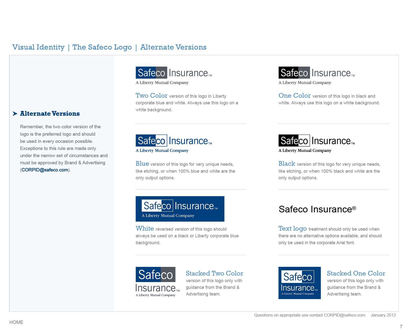
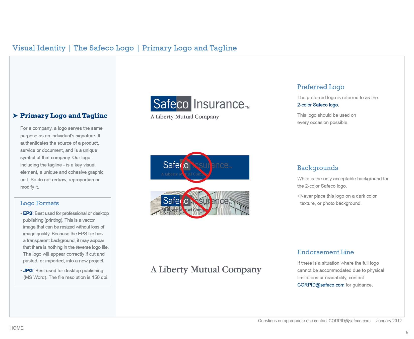
- Led the design and development of comprehensive brand guidelines
- Designed materials for in-person brand rallies and training events
- Created digital tools, including a fully designed and coded brand microsite
- Redesigned legacy marketing collateral to align with the new identity
- Acted as a brand steward, ensuring consistency across all touchpoints
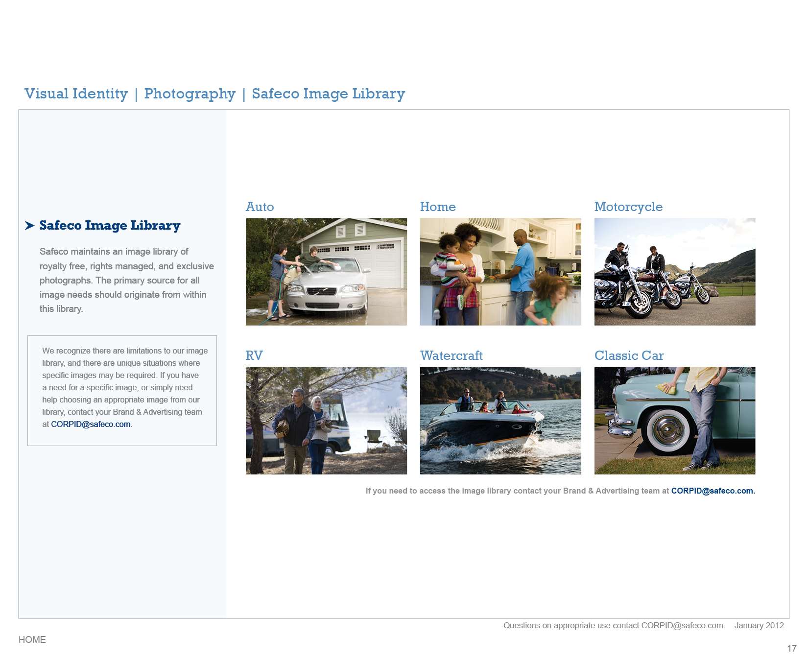
- Sourced and licensed imagery to support scalable, compliant brand use
I also collaborated closely with a junior designer, providing direction and ensuring quality and consistency across deliverables.
Accessibility & Inclusion
Accessibility was embedded in both the design system and its implementation:
-
Clear typographic hierarchy to support quick scanning and comprehension
-
High-contrast color usage aligned with accessibility standards
-
Plain-language design principles to support a wide range of users
-
Structured layouts that reduced cognitive load in complex materials
-
Tools designed for usability by non-designers across varying skill levels
The goal was to create a system that was not only visually cohesive, but intuitive, inclusive, and easy to adopt at scale.
Multi-Channel Execution
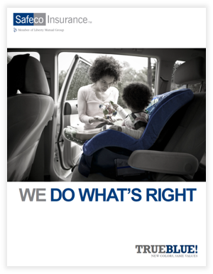
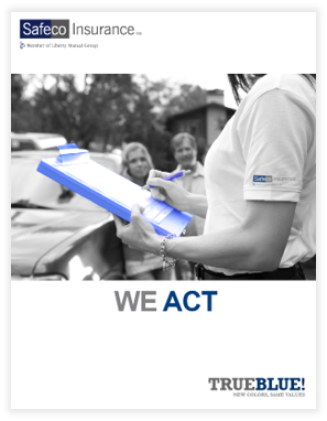
1. Print — Brand Guidelines & Marketing Collateral
Print materials served as the foundation of the brand system.
Deliverables included:
-
Comprehensive brand guidelines
-
Educational posters for live events
-
Redesigned brochures and marketing collateral
Highlights:
-
Designed for real-world use, not just reference
-
Clear, actionable guidance for non-designers
-
Modular system adaptable across formats and teams

2. Digital — Brand Microsite
I designed and coded a centralized microsite that acted as a single source of truth for the new brand.
Highlights:
-
Consolidated guidelines, templates, and tools in one accessible platform
-
Designed for intuitive navigation and quick information retrieval
-
Extended the print system into a scalable digital experience
-
Enabled ongoing adoption beyond initial rollout
3. Experiential & Interactive — Brand Rallies + Learning Tools + Gamifying
Live experiences were the entry point for brand adoption.
Deliverables included:
-
Rally presentations and environmental graphics
-
Interactive games reinforcing brand concepts and personas
-
Motion-based educational content
Highlights:
-
Translated abstract brand strategy into memorable experiences
-
Reinforced learning through interaction and participation
-
Created emotional engagement alongside functional understanding
4. Video Promotion to Independent Agents
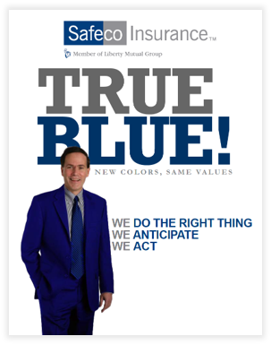
We wanted agents to remember our commitment to our business partnership. We launched the company's first nationwide ad campaign, and I created this video in Premiere Pro and After Effects to promote the effort. I even wrote most of the script.
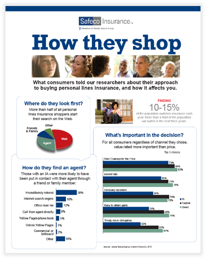
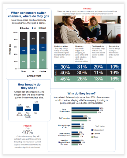
Case Highlight: Brochure Redesign
As part of the campaign, I redesigned a key customer-facing brochure.
The Challenge
The original prioritized completeness over clarity, making it difficult for users to quickly understand coverage options.

The Solution
I restructured the content to prioritize scanability, clarity, and relevance, transforming it into a more intuitive and engaging experience.

Impact:
- Faster comprehension of key benefits
- Improved usability in both guided and self-serve contexts
- Stronger alignment with Safeco’s customer-first positioning
- More effective as a persuasive marketing tool rather than a reference document
Campaign Outcome
The campaign successfully created a cohesive, scalable brand ecosystem that:
- Enabled rapid alignment across employees and agents
-
Improved consistency across channels and communications
-
Transformed brand guidelines into practical, everyday tools
-
Supported long-term adoption of the new brand identity