UI/UX Design and front-end expertise
Core strengths
- Graduated with top honors from Coding Dojo in React in 2022.
- Great communication and listening to keep the design and dev teams aligned
- Determine options and present various timelines to set expectations for business owners, designers and developers
- Generate concepts aligning to those requirements
- UI/UX design execution: XD, Sketch, Figma, Photoshop, Illustrator.
- Give specific and clear directions to the developers through interactive mocks
- Design, code and launch content pages and changes using HTML, CSS, WordPress, and SAP Hyrbis CMS impex language
- Create reusable components to speed project delivery and unify the design of the site
Tire Pros Redesigned User Flows
Goal: Account for every scenario on the user path to purchase during redesign of site.
Role: Designed mocks incorporating site redesign for B2B branch of our business. Provided developers with pixel-perfect instructions via Figma.
Extra stuff: Coded every static page in our CMS.
Note: The complexity of buying tires means we had to account for every scenario encoutered by users during the purchase funnel. Discovery interviews and requirements meetings make a big difference. Regular checkins are essential. Are we missing something? It's important to know every element that might go into a design.
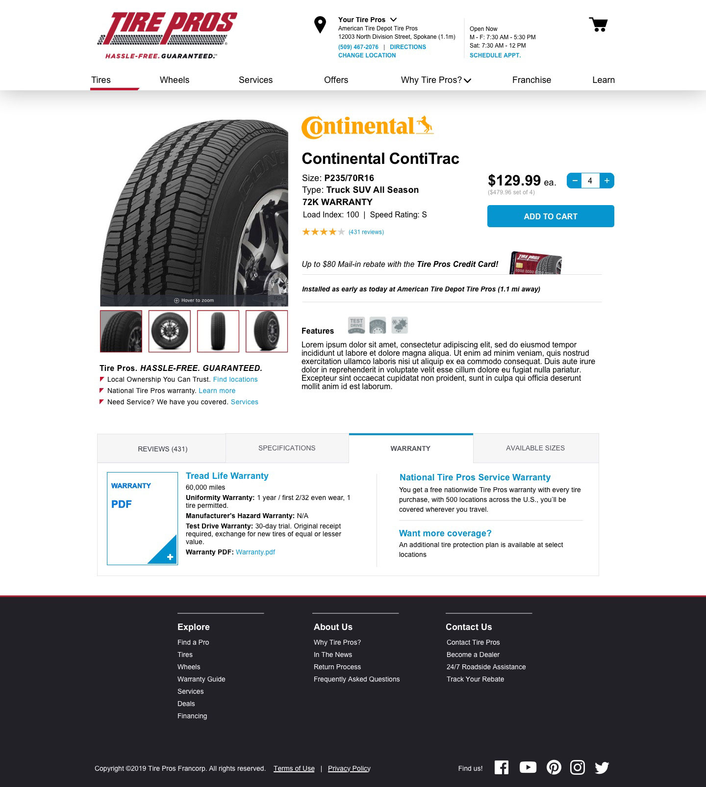
Scenario
- We have found the tire the user wants.
- We're displaying our promo offers.
- Tire features are displayed.
- Warrenty tab is open.
Scenario
- We have found the tire the user wants.
- We're displaying our promo offers.
- Tab shows alternate size option and its details.
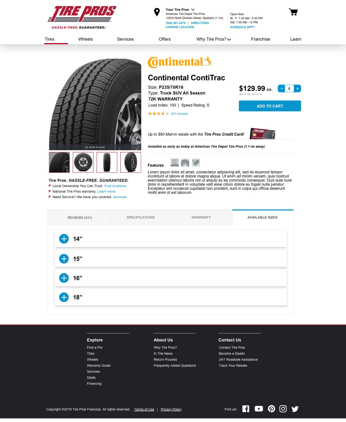
Scenario
- We have found the tire the user wants.
- We're displaying our promo offers.
- Tire features are displayed.
- Sizes tab open displaying those options.
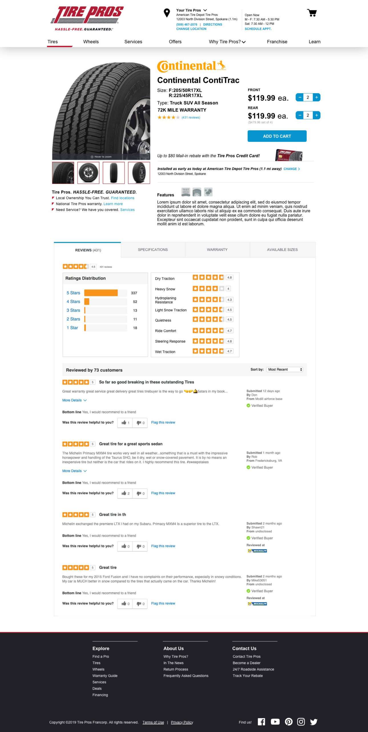
Scenario
- We have found the tire the user wants.
- We're displaying our promo offers.
- Reviews tab open.
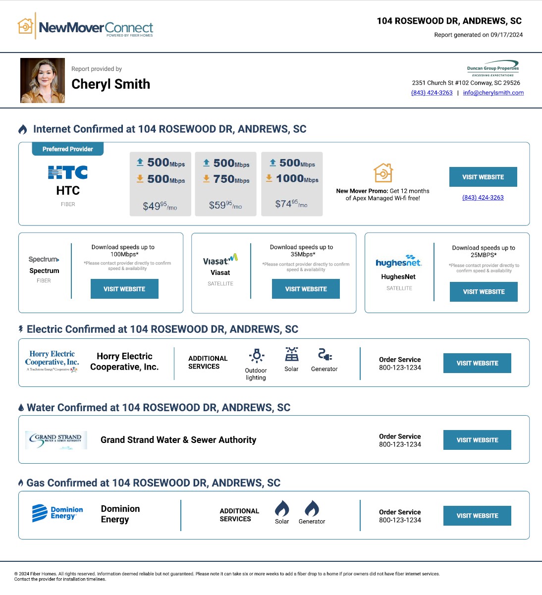
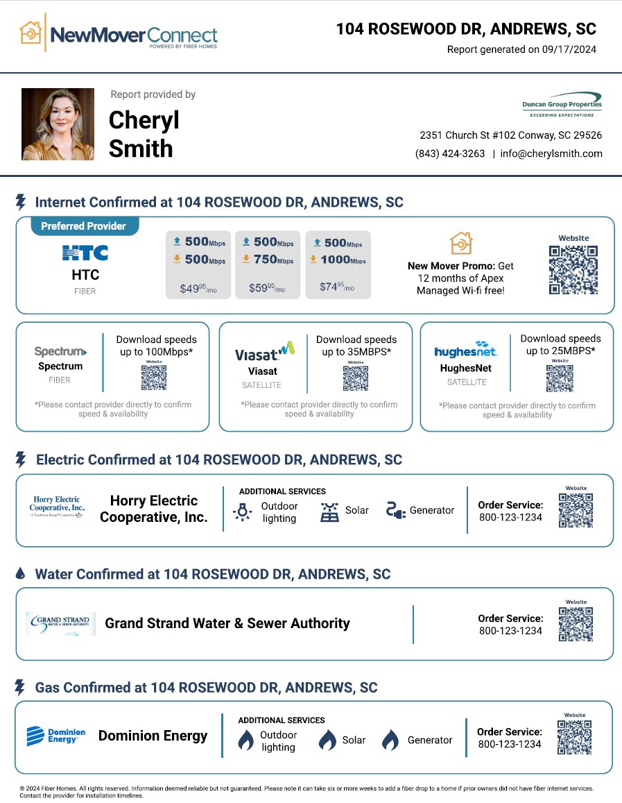
DXTel New Mover Connect
Goal: Use B2B marketing platform to provide real estate agents with easy-to-use site and/or print communication to help their clients find and connect to local services.
Note: These are unfinished mocks produced before the company was sold.
Web landing page
Print alternative
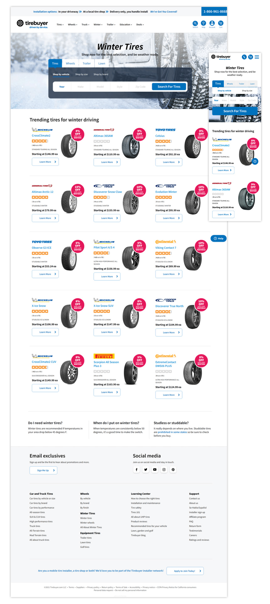
Tirebuyer: Winter tires
Goal: Add dynamic component to display discounts on each product.
Role: Add element to the design within the allotted space while also ansuring it would stand out. I also coded the element into the component.
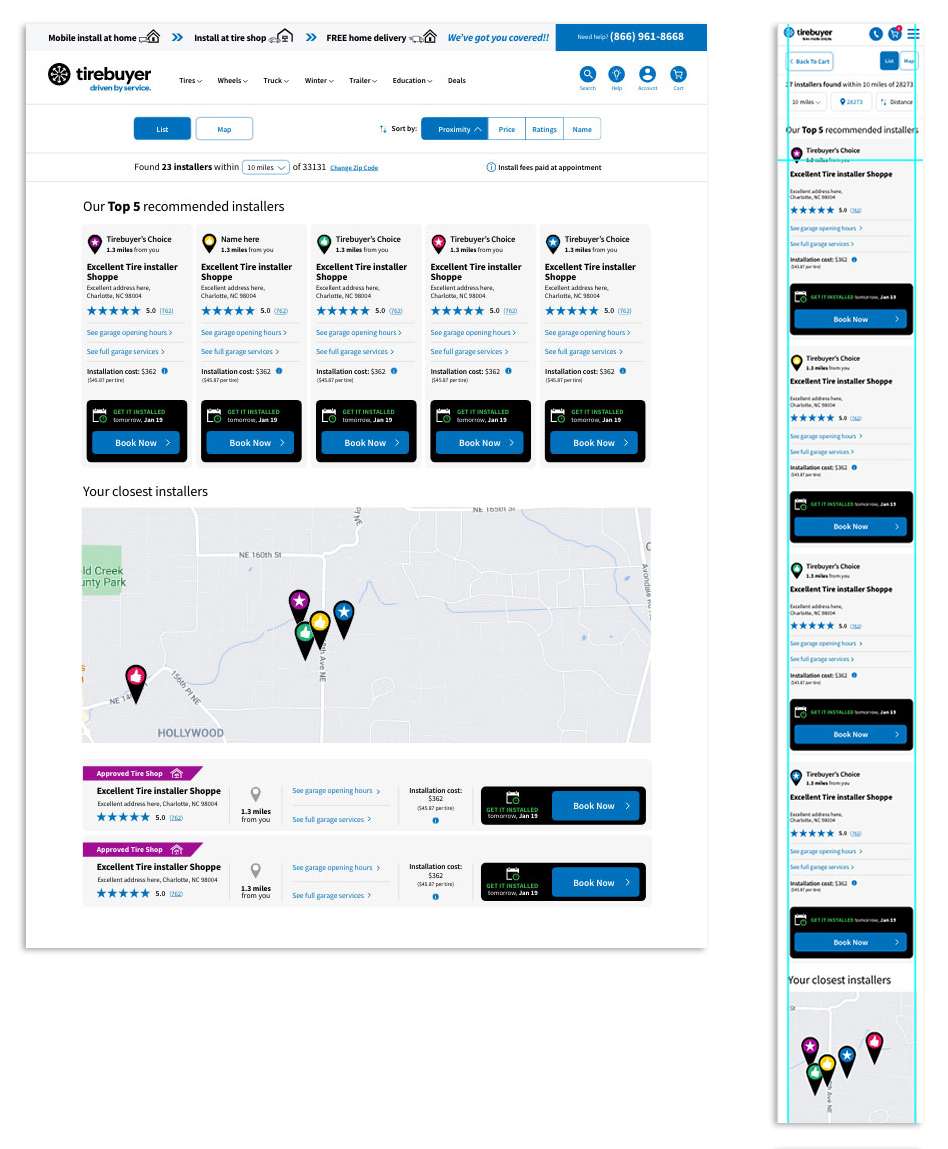
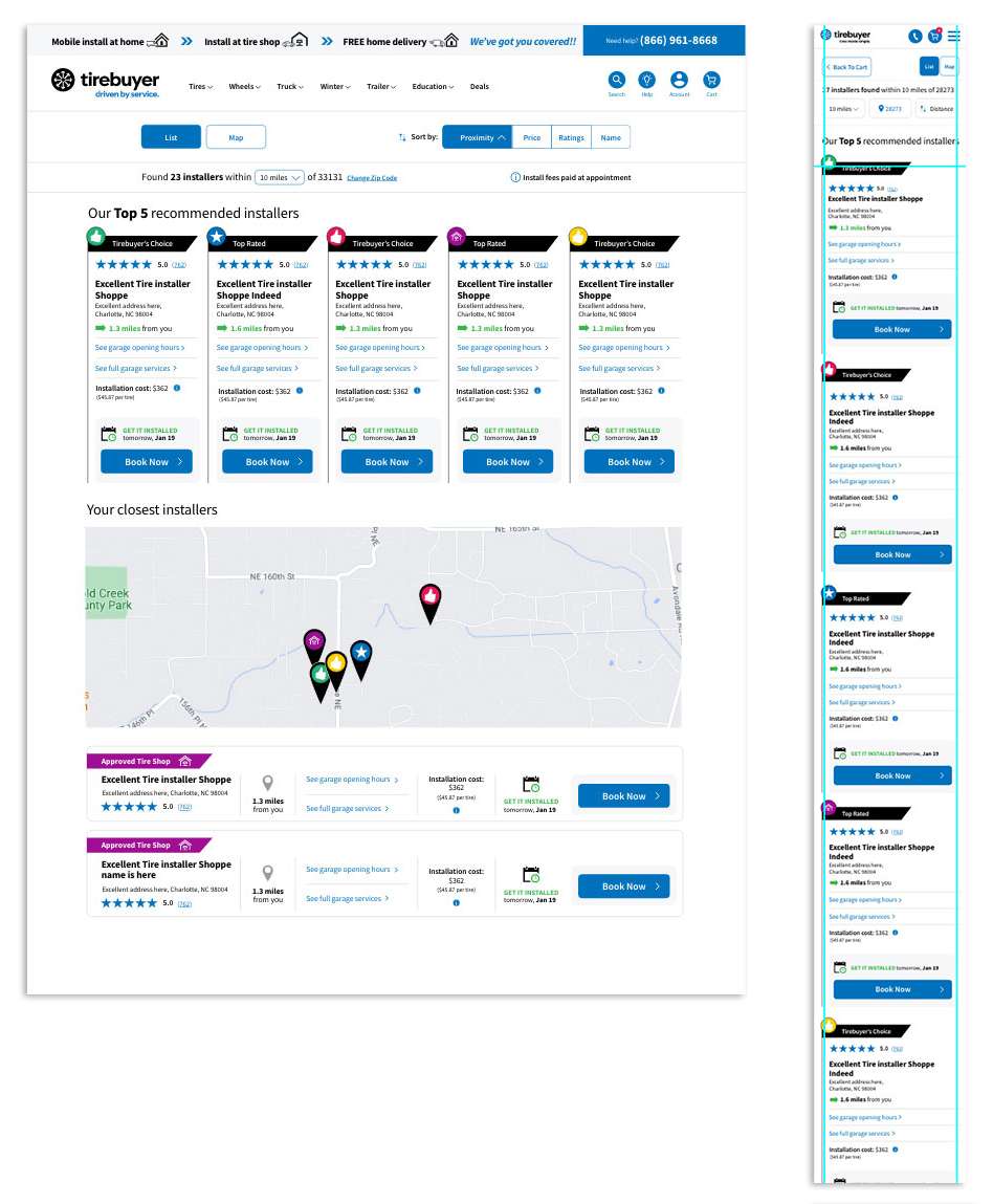
Tire installer selection mocks
Goal: Give users a choice between different available installers.
Role: Create mockups that attempt to display lots of information in a digestable form. Lead users to preferred installers. Here are a couple of the mocks I provided.
Bold CTA
Color Icon
